How the Weekly Leaderboard Works: Scoring, Rankings, and Visualization
Understanding how we calculate weekly scores, track rankings throughout the week, and visualize activity patterns in your group.
Introduction
The weekly leaderboard in Lasso provides a dynamic, real-time view of how group members are performing relative to their own personal baselines. Unlike traditional leaderboards that simply compare raw numbers, Lasso creates a fair playing field by scoring each member based on how their current week compares to their historical performance. This ensures that both the weekend warrior and the daily trainer have an equal chance to compete meaningfully.
The leaderboard updates automatically throughout the week as activities are added, and it includes rich visualizations to help you see activity patterns at a glance and track how rankings evolve day by day.
The Six Scoring Categories
Each member's weekly score is calculated from six distinct categories, with a maximum total of 100 points:
1. Work Score (22 points max)
Measures the volume of activity—distance, duration, and elevation gain—relative to your personal baseline. Different sports are weighted appropriately (for example, trail runs and hikes get extra credit for elevation, while swimming emphasizes distance). This category rewards consistency and effort relative to what you typically do.
2. Intensity Score (22 points max)
Captures how hard you're working relative to your baseline. We use heart rate zones when available, power zones for cycling, or perceived exertion scores. Higher intensity efforts—like interval training or threshold runs—contribute more to this score than easy recovery sessions.
3. Consistency Score (16 points max)
Rewards spreading activity throughout the week rather than cramming everything into one or two days. Each active day contributes to your score, with a bonus for activities spread across four or more different days. This encourages sustainable training habits.
4. Difficulty Score (16 points max)
Recognizes challenging activities like steep climbs, technical terrain, track intervals, or extreme weather conditions. Each sport has its own difficulty calculation—mountain biking gets credit for technical descents, running rewards elevation gain and grade, and extreme weather conditions (like heat waves or blizzards) add a boost.
5. Highlights Score (14 points max)
Bonus points for standout activities—personal records, achievements, or activities that get mentioned in the weekly pulse. This adds a bit of excitement and recognizes exceptional efforts that might not show up in volume or intensity metrics alone.
6. Variety Score (10 points max)
Encourages mixing different sports and exploring new locations. You get points for trying different activity types and visiting unique locations throughout the week. This keeps things interesting and prevents the leaderboard from becoming too narrow.
Baseline Calculation
All scoring is relative to your personal baseline, which is calculated from your activity history over the past 12 weeks. This baseline includes average weekly distance, elevation gain, moving time, training load, work units, difficulty units, and active days.
By comparing your current week to your baseline, we ensure that:
- A member who typically runs 10 miles per week gets recognized for doing 20 miles, even if another member normally does 50
- Improvement and consistency matter more than absolute numbers
- Everyone has a fair shot at the top spot by pushing beyond their usual routine
Real-Time Updates
The leaderboard recalculates automatically whenever a new activity is added to the group. Each activity contributes to the six scoring categories, and rankings update immediately to reflect the current standings. This means you can see your rank change in real-time as the week progresses.
We also take daily snapshots of the leaderboard throughout the week, which allows us to track how rankings evolve and visualize rank changes over time.
Activity Circles: Visualizing Daily Effort
The leaderboard includes a visual activity matrix that shows at a glance when each member was active during the week. Each day gets an activity circle that encodes both the presence of activity and the effort level.
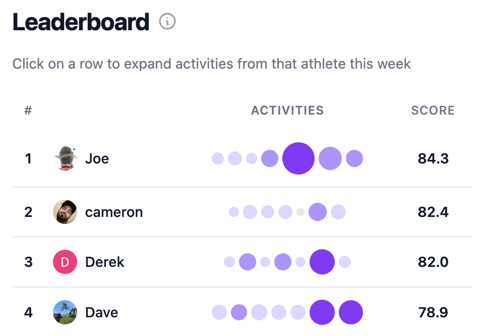
Circle Size
The size of each activity circle reflects the effort level for that day, normalized against the maximum effort seen across all members for that week. Circles range from 8 pixels (smallest) to 32 pixels (largest), giving you an immediate visual sense of how intense each day's activities were relative to the rest of the group.
Circle Color
The color intensity of each circle provides another dimension of information about effort. Circles use a purple gradient:
- Light purple: Lower effort days (bottom third of effort range)
- Medium purple: Moderate effort days (middle third)
- Dark purple: High effort days (top third)
This color coding works alongside the size to give you a quick read on activity patterns. You can immediately spot who had big days, who spread their effort evenly, or who might have been resting.
Rank Change Plot: Tracking Momentum
One of the most powerful features of the leaderboard is the rank change plot, which visualizes how each member's position evolves throughout the week. This chart shows the ebb and flow of competition as activities are added.
The rank change plot displays each member as a line, with rank position on the y-axis (lower is better) and days of the week on the x-axis. You can see:
- Who started strong and maintained their position
- Who made late-week surges to climb the rankings
- How tight the competition is at different points in the week
- Patterns in when members tend to be most active
This visualization helps you understand not just where everyone ended up, but how they got there—revealing the strategic and timing aspects of the competition.
Daily Snapshots
To enable the rank change visualization and track momentum throughout the week, we take daily snapshots of the leaderboard. These snapshots capture each member's rank and scores at that moment in time, creating a historical record of how the competition unfolded.
Each snapshot is taken at the end of the day (in Pacific Time), so the rank change plot reflects how standings looked at the close of each day. This allows you to see how weekend warriors compare to those who maintain consistent activity throughout the week.
How Rankings Are Calculated
Rankings are determined by sorting members by their total score in descending order. Members with identical total scores are ranked by tie-breaking criteria that prioritize work and intensity scores, ensuring that meaningful activity wins out over edge cases.
When a new activity is added, the affected member's scores are recalculated, and all rankings are refreshed. This means that your rank can change not just from your own activities, but also when other members add activities that push them ahead of you.
Interactive Features
The leaderboard is fully interactive. Clicking on a member's row expands to show all their activities from that week, making it easy to dive into the details behind their score. You can see exactly which activities contributed to their total and understand what drove their performance.
A help icon next to the leaderboard title opens a detailed breakdown of how each scoring category works, so you can understand what you need to focus on to improve your rank.
Conclusion
The weekly leaderboard in Lasso creates a fair, engaging competition by scoring members relative to their personal baselines rather than comparing absolute numbers. The combination of six scoring categories ensures that different types of athletes can compete meaningfully, while the activity circles and rank change plot provide rich visualizations that make it easy to understand patterns and momentum throughout the week.
By focusing on improvement, consistency, and effort relative to your own history, the leaderboard encourages healthy competition and sustainable training habits—whether you're a daily trainer or a weekend warrior.